In 2007, Former NIKE executives decided to take a different approach to the clothing market and incorporate more sustainable practices. The effort was: NAU Clothing.
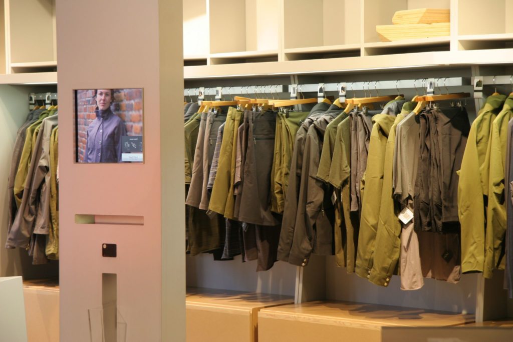
Like Amazon Prime, Brick & Mortar Integrated
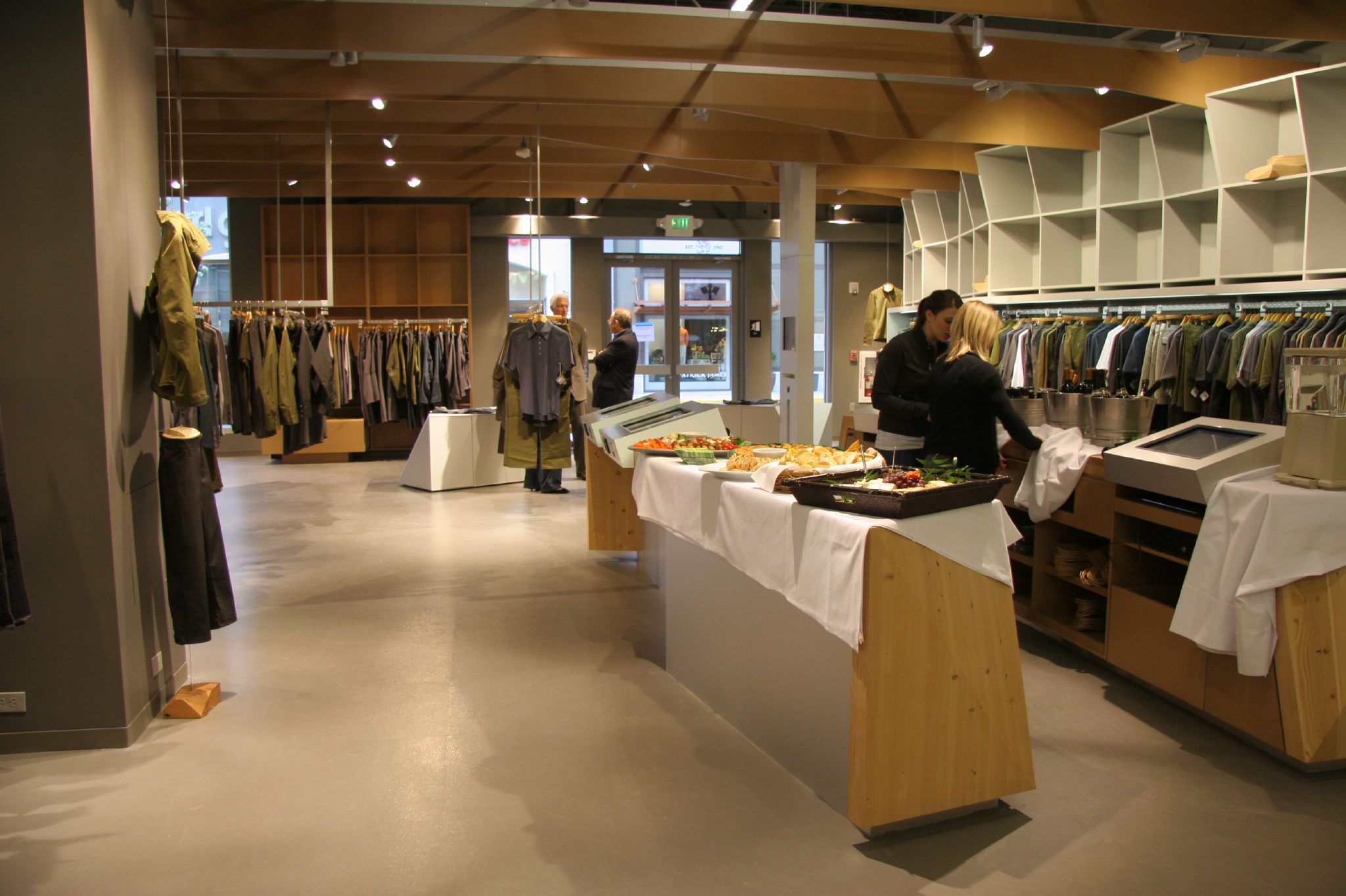
It centered around a bold concept that customers would enter a brick-and-mortar store, try on clothing, assure correct fit, and then use a touch-screen kiosk (and barcode pieces) to purchase, but the clothing would arrive the next day via shipping.
They spent months thinking it through, working on the approach, and in the vital last few months of the experience, like many start-ups: ran into major snags.
We were called in, to architect and develop the in-store interfaces that customers would use to not just learn more about the product and how they were sustainably crafted but to complete their purchase. Anywhere in the store.
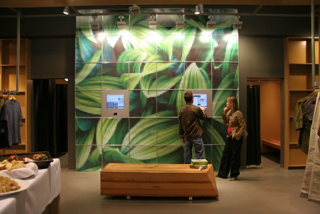
See donations in action where it’s needed the most.
Additionally, the website they had spent millions developing still didn’t work, and they hadn’t even begun work on the “Partners for Change – Giving Wall.”
At the end of each purchase, consumers were allowed to decide what non-profit their percentage contribution of the sale went to, and learn more about the effects their contribution would have.
Nau needed someone to come in and get things back on track, and on an aggressive timeline, and they reached out to what was one of the best digital shops in Portland in 2007: Opus Creative, where I was Senior Producer.
The team assembled, and we undertook three courses of action:
- Debugging the existing website experience, which is integrated into their global supply chain ERP system. Buried in hundreds of thousands of lines of code, something was incorrect, and we had to find that needle in the haystack.
- Begin IA and UX on the Partners for Change Giving Wall, and prepare the development team to complete it.
- Start testing the scanning equipment that we would tie the Product Kiosk into, and develop an architecture that could handle the current product clothing offerings and accommodate all future seasonal product additions.
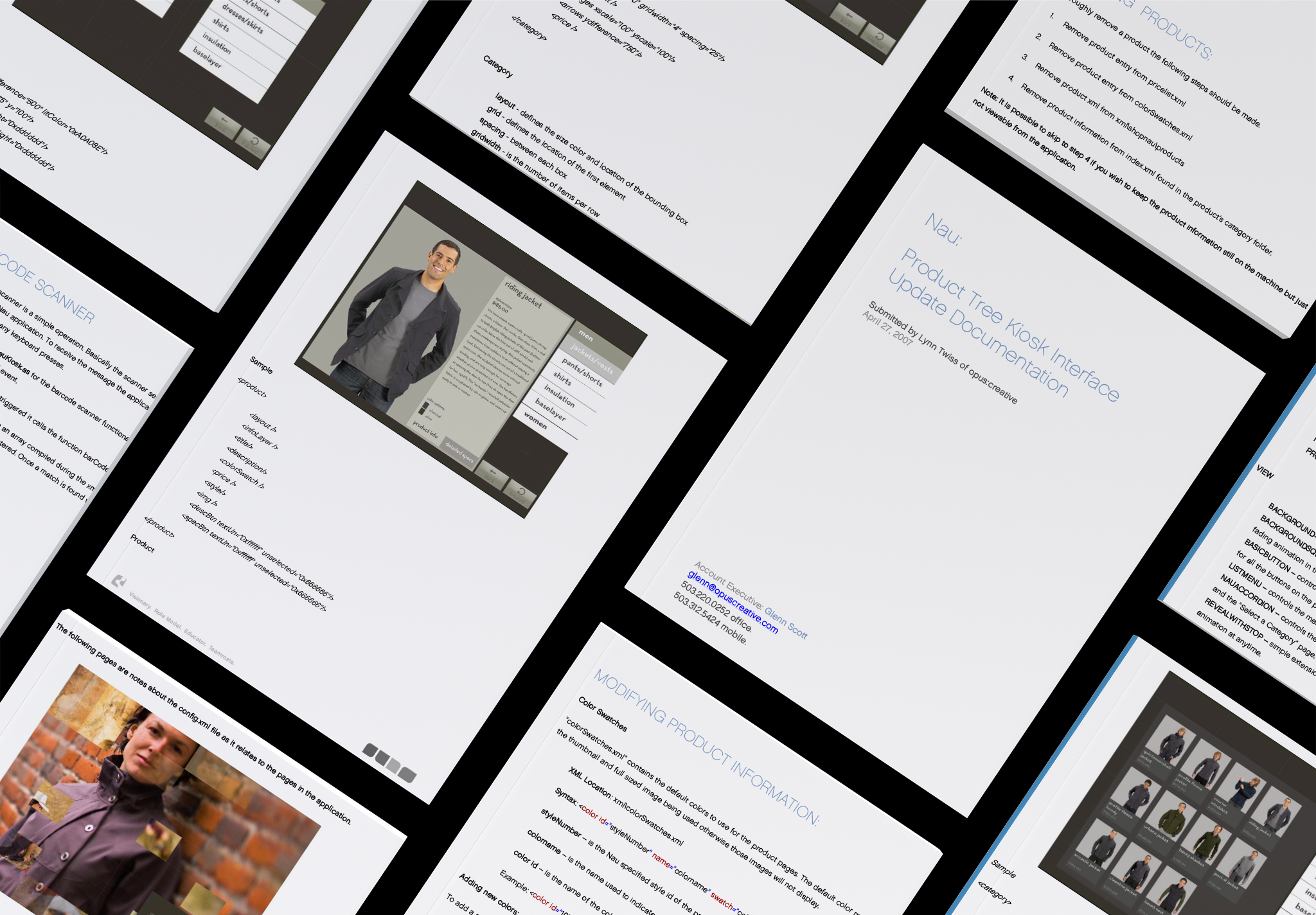
Seasonal Update Documentation.
The product scanning kiosk was driven by lightweight XML files, that would require manual updates from a central server. The documentation was straightforward and had an architecture that would accommodate many further expansions of the clothing line.
The three projects took a total of 8 weeks time from kick-off to completion.
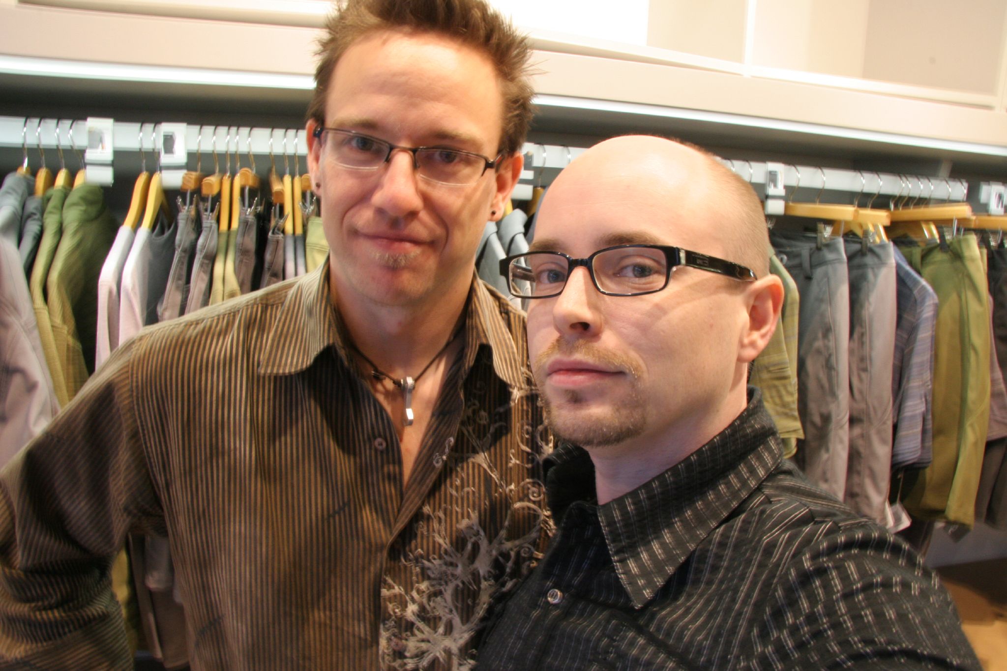
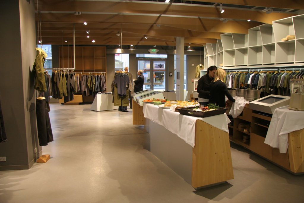
Seen throughout this post are images I took at the launch of the flagship NAU clothing store at Bridgeport Village, in Oregon.
For me, it was a thrill to be utilizing all my skills, and passions: My coding experience from Kimber, the producing skills I had been taught at Opus Creative, and working in the fashion industry – if only tangentially.
Opus Creative Project Team:
| Role | Responsible |
|---|---|
| Creative Director | David Lowe-Rogstad |
| Account Executive | Glenn Scott |
| Sr. Producer | Lynn Twiss |
| Developer | Michael Godfrey |
| Designer (Giving Wall) | Jessie White |
